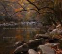
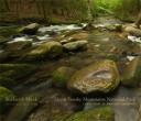
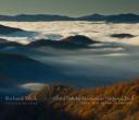
For the last few months I have been hard at work editing the images for my next book Great Smoky Mountains National Park: Thirty Years of American Landscapes. Part of the process of course is editing your work, both in deciding what images to use in the book, and then in working with each image individually to achieve the best possible printed piece. While this later part is done in Photoshop – it is much like being in the darkroom and making sure the “print” you end up with is what you had pre-visualized in the field.
I recently was on a friends blog where he talked about editing film and how there was a space of time between when you took the image and when you finally had a chance to see the image in film form after processing. His thought was that the distance in time helped you make better decisions about the images because the emotion of the day when you shot it was not as fresh. There may be something to that, especially in the day of digital photography where folks tend to edit their work even while it is still in the camera! This is never, never to be done! How can you tell what it really looks like on a 2” low resolution screen? It’s great for making sure your close on the exposure – although the histogram is better – I would never delete an image based on what I see at that point. But I digress.
Having worked on images from over a thirty year time span I have found the same emotions, or at least ones close to them come streaming back as I look at the images. I happen to be able to remember almost everything about a photograph I have taken – too bad I can’t remember things like that in real life – but it makes it easier for me to remember what I wanted the photograph to say and thereby make the correct adjustments to an image. Creating an image which comes as close as possible to what I was feeling and intended the image to look like in the first place.
The hardest part of editing is deciding which images should make the grade and be in the book. An example is the cover shot. Because of its importance it also has some additional requirements which must be met. It has to pull people in, take it off the book store shelf and make them want to open the book. Therefore, I tend to look at the covers of similar books, in this case other photographic books on
I think in some ways, my friend might have been right about distance and time in editing at least in this case. I let go of an image I really liked and had an emotional attachment to. And now that I see the new cover image I like it even better than my first choice. So what is your opinion – let me know – I’d love to hear your opinions too!
Peace,
Richard


