Pre-Order Great Smoky Mountains National Park: Thirty Years of American Landscapes

Great Smoky Mountains National Park: Thirty Years of American Landscapes

Great Smoky Mountains National Park: Thirty Years of American Landscapes

ISBN: 978-0-9753954-2-4

220 pages, 245 images, 11×13”

Quiet Light Publishing

Publisher’s Price: $60.00

Pre-Order Price: $45.00 (until June 1, 2009)


Four years ago today we released my first book, The Lewis & Clark Trail American Landscapes. As soon as you come out with your first book, the question is…so what’s your next project and when will it come out. Well, now. Kind of. You can now pre-order our second book, Great Smoky Mountains National Park: Thirty Years of American Landscapes. I have been training my lens on the park for just over thirty years so it made sense that my next book would on the park.


I began my quest to become a landscape photographer while on my first trip to Great Smoky Mountains National Park back in 1974 with my future wife, Kathy. I was not then as intense about photography as I am now. I was just beginning my journey and in all honesty wanted to find the closest national park to my home in Illinois. I chose the Smokies and the love affair began – between me and the park and between my wife and I. Since then I have visited many of our national parks, but I continue to be drawn back to the beauty, diversity, and complexity of the Smokies. It is, after all, a park that offers everything: historic buildings and living history, magnificent streams and waterfalls, a variety of old-growth and new-growth forests, large fields and coves with abundant wildlife, and of course, those stunning vistas into “smoke” filled valleys.

Over thirty years, many things have changed, and many others have stayed the same. The Fraser firs on Clingmans Dome have almost been destroyed by the Balsam Wooly Adelgid, yet younger trees now crowd the understory. Portions of the Alum Cave trail were inundated by a landslide during a thunderstorm. Cades Cove is no longer farmed. Logging operations cleared much of what is today parkland. Yet to the inexperienced eye, the places where lumber companies clear-cut mountainsides in the late 1800s and early 1900s are barely perceptible, a testament to both Mother Nature’s ability to regenerate and remove the scars of mankind, and to mankind itself for having the foresight to preserve this remarkable landscape. In some cases, entire species have disappeared from the area, like the buffalo and wolves, or even from the earth entirely as is the case with the passenger pigeon. But other species have been reintroduced. Elk have been returned to Cataloochee and have migrated into other areas of the park. The synchronized fireflies have been around forever, but only in the last 15 years have they become a popular treat if you are lucky enough to catch their 10-day show in early summer.

Some of these changes are reflected in this book, whether a black and white image of an old barn taken in 1976, or one of my last shots of a sunrise as seen from Newfound Gap in November 2008. I hope you will enjoy my vision of Great Smoky Mountains National Park. It is a jewel in our national park system. My wish is that you will come to love, as I do, the details of the leaves, the rush of water in the streams, the colors of the landscape as it changes from season to season.  

You can preview the book using the link: GSMNP Book Preview 

Our release date is July 1, 2009, but pre-orders start today, at the reduced price for readers of this blog of $45.00. So order now, and put the words BLOG in the comment area to insure your discounted price. We will not charge your card until we ship your order. Readers of this blog are the first to be able to order! GSMNP Book Pre-Order 

Thanks! Hope you’ll enjoy this new release! Stay tuned for more as we move forward! 

Richard Mack 


Painful for a Photographer – Converting RGB to CMYK

smnp-20060502-1670-rbg.jpg    smnp-20060502-1670-cmyk.jpg

I am at the point in the Great Smoky Mountain National Park: Thirty Years of American Landscapes book project where it is time to convert the images into the CMYK color space for the press. It is a very painful process. As photographers we see in a full spectrum of colors, shoot for the widest range in the color spectrum, in 16bit Raw files, import them into Photoshop in ProPhoto color space (you do use this now don’t you?) all of which gives us the largest color space we can have. This provides for beautiful images onscreen and in our fine art prints. But the book world uses the color space for commercial presses, the world of four to six color presses and the world of CMYK, a much smaller color space than we work in. So we suffer the long slow pain of watching our colors disappear when we hit the Convert to CMYK button.

Any color out of gamut (outside the target color space) will be clipped into the CMYK color space, which for me in this case is usually the bright yellows and greens of that early morning light in the leaves. So, after getting up early to be there for the golden light, taking care to bring the colors to life in Photoshop and having things look great, we end up cringing as we hit that Convert to CMYK color space. I am converting to the CMYK color my press has specified for their use, basically SWOP coated. So how do you get back some of the colors which have been clipped?

Well, if you look online for answers, you will find everyone has a different opinion. So here is how I have come to process images. Once you have your final RGB file set (and saved), flatten the layers and then take a look at it. Click the Preview button on and off to get an idea of what things will turn into and I have on occasion then upped the saturation of the greens only by about 10% and then converted to CMYK, although this seems to work only occasionally.

As you hit the convert button, please, and this is important, utter the words “bye bye color”.

Most often the beautiful light yellow greens will turn into a cyan bluish color. So what now? I go to the levels and change the cyan levels slightly starting with the middle which I put at 1.00 or 1.15 then adjust the high and low sliders to taste. Then select Hue/Saturation and once again go to the greens and yellows separately and up them 10-20% be careful though you don’t go too far and wash out detail. You might want to also add some black in the greens and/or on the black channel as well. You might find there are more things to try as well, maybe in the curves adjusting each channel separately, or going into the selective colors and adjusting the Cyan and yellow levels in the green layer. Depending on the image you are working on it may take any combination of these actions. Make sure you save it as a different named file – I put CMYK at the end of the file name. No most likely you still won’t be happy with the results but they should be fairly acceptable.

smnp-20060502-3109-rgb.jpg     smnp-20060502-3109-cmyk.jpg

One last thought. Don’t go back and forth between the original file or transparency and try to match it. You won’t be able to. All you can do now is make it look as good as you can given the smaller color space you have to work with. While this is something all of us photographers hate to think about – our work not being shown at it’s absolute best, have faith that your printer will be very good at what they do and things will turn out alright – especially if you’ve selected the right printer to work with. And remember, every photographer who has had work printed in any form has faced this dilemma at some point. I happen to be lucky enough to have an original Ansel Adams print, one which is also in one of his early books. While the reproduction in the book is very good, it does not compare with the original print. So he had the same problem.


On my last book, The Lewis & Clark Trail American Landscapes I worked with Stinehour Press and they made the separations from the original transparencies. There I had the magic of John Stinehour to help. They have, sadly, gone the way of many presses in the United States and are no linger around. I could say to John – “It needs your magic to make it pop” and he would do something and it would happen. There are moments in this process I wish I had John and his wisdom sitting next to me telling me what to do. The Great Smoky Mountain National Park: Thirty Years of American Landscapes book is mostly digital images which I am now converting for our new printer CS Graphics. And I am confident they will be able to make these images as beautiful as before, but I still hate it when I push that Convert to CMYK button.


Peace,

Richard Mack


The Art of Editing

Great Smoky Mountains National Park: Thirty Years of American Landscapes 

For the last few months I have been hard at work editing the images for my next book Great Smoky Mountains National Park: Thirty Years of American Landscapes. Part of the process of course is editing your work, both in deciding what images to use in the book, and then in working with each image individually to achieve the best possible printed piece. While this later part is done in Photoshop – it is much like being in the darkroom and making sure the “print” you end up with is what you had pre-visualized in the field.

I recently was on a friends blog where he talked about editing film and how there was a space of time between when you took the image and when you finally had a chance to see the image in film form after processing. His thought was that the distance in time helped you make better decisions about the images because the emotion of the day when you shot it was not as fresh. There may be something to that, especially in the day of digital photography where folks tend to edit their work even while it is still in the camera! This is never, never to be done! How can you tell what it really looks like on a 2” low resolution screen? It’s great for making sure your close on the exposure – although the histogram is better – I would never delete an image based on what I see at that point. But I digress.


Having worked on images from over a thirty year time span I have found the same emotions, or at least ones close to them come streaming back as I look at the images. I happen to be able to remember almost everything about a photograph I have taken – too bad I can’t remember things like that in real life – but it makes it easier for me to remember what I wanted the photograph to say and thereby make the correct adjustments to an image. Creating an image which comes as close as possible to what I was feeling and intended the image to look like in the first place.


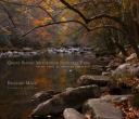
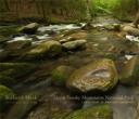
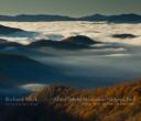
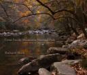
The hardest part of editing is deciding which images should make the grade and be in the book. An example is the cover shot. Because of its importance it also has some additional requirements which must be met. It has to pull people in, take it off the book store shelf and make them want to open the book. Therefore, I tend to look at the covers of similar books, in this case other photographic books on Great Smoky Mountains National Park. I do this because I don’t want my book to look like theirs. I look for an image which will say something about the book but also have a more artistic bend to it. I had a working cover image for a long time from a shot I really loved. But when all was said and done it did not make the grade. Another shot seemed to work better and had a more emotional pull for those who saw all three covers (hey we started with a lot more ideas but narrowed it down to three before subjecting folks to give their opinions).

GSMNP Book Cover - Choice #2

GSMNP Book Cover - Choice #3

I think in some ways, my friend might have been right about distance and time in editing at least in this case. I let go of an image I really liked and had an emotional attachment to. And now that I see the new cover image I like it even better than my first choice. So what is your opinion – let me know – I’d love to hear your opinions too!


Peace,

Richard


Remembering at Arlington – Pan Am Flight 103

Holding Hands - by Ken Cedeno

On December 21st, about 500 folks gathered at Arlington Cemetery, the site of the National Memorial Cairn, a gift from the people of Scotland to the United States honoring the 270 victims of the terrorist bombing of Pan Am Flight 103 over Lockerbie, Scotland twenty years ago. It was a time to come together and gather as one, even if in several places, as we did simultaneously in Lockerbie and at Syracuse University, where 35 students were lost on that fateful day, along with those of us gathered at Arlington. It was a time to remember our loved ones, locked in time twenty years back and wonder what lives they might have lead if allowed to. It was a time to remember what we did, as a group of ordinary citizens, to change the way this country and the world looks at terrorism. We passed laws to make the skies safer, to allow victims of terrorist actions to bring legal actions against the country which sponsors such actions, we pressed the US and British governments to find the evidence to convict those responsible, and then had to press the United Nations to bring the most severe sanctions in it’s history against Libya, for their responsibility until they turned over those indicted. It turns out we have fought these fights for twenty years, and sadly we are not done, now enduring yet another appeal on behalf of Abdelbaset Al Megrahi, the only Libyan Secret Service Agent convicted under Scottish law. At one point we were told our group Victims of Pan Am Flight 103 (www.victimsofpanamflight103.org) was second in power only to the NRA. There was a component to the weekend of coming together to remember all of our work and exchange stories of how we did what we did, and where we all our today. I am no longer actively involved with the group, having left the board and stepping down as President in the mid 90’s. But many have carried on since then and will continue in the future.

2008_12_21_103_lockerbie_0258.jpg

There is no way to tell the story of what we have been through. And yet, a friend of mine, a fellow photographer, now based in Washington and covering the Capital and White House among other things, has captured images from that afternoon at Arlington. They convey the emotions and feelings of that cold afternoon. Ken Cedeno (www.kencedeno.com) worked for me in Chicago at the time of the disaster. He called to say he was bringing a gift over to us when my wife told him it might not be the best time. Over the following year he saw first hand what one goes through after a disaster like this. He volunteered to cover the anniversary event on his own. As I have said, he did a magnificent job. There is a reason he is one of the finest editorial photographer’s working today. I think you can see in his imagery the power of the day, the emotions, the capturing of the moment. Having been there I can also hear the words spoken, the bag pipes and taps being played by the military trumpeter. To me this is editorial photography at its finest. All I can say is a big thank you to Ken for covering the event. You have given us all a wonderful way to remember the spirit of the day.

Peace,

Richard Mack


To see a more extensive collection of the images from Arlington use this link:

http://kencedeno.com/PanAm103/index.html All images on this post are copyrighted by Ken Cedeno.

2008_12_21_103_lockerbie_0525.jpg